|
|
Math 121 - Calculus for
Biology I
Spring Semester, 2000 © 1999, All Rights Reserved, SDSU & Joseph M. Mahaffy San Diego State University -- This page last updated 4-Jan-00 |
|
|
Math 121 - Calculus for
Biology I
Spring Semester, 2000 © 1999, All Rights Reserved, SDSU & Joseph M. Mahaffy San Diego State University -- This page last updated 4-Jan-00 |
![]()
This page is to help you fulfill some of the general tasks that your labs may require you to do.
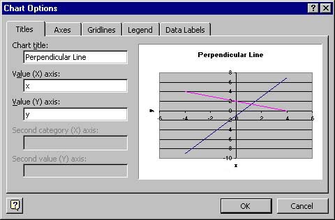
Goto Chart --> Chart options
Under the "Titles" tab, you have the following spaces to fill in the required information
Chart title, Value (X) axis, and Value (Y) axis
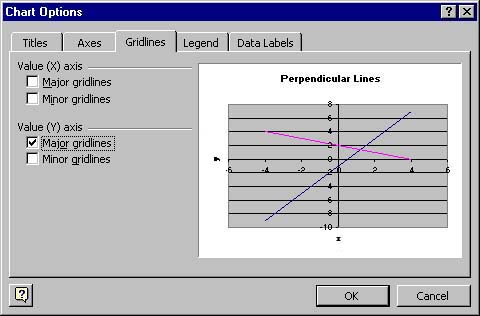
Goto Chart --> Chart options
Under the "Gridlines" tab, you have the options to select which grids you want active in your graph.
You want to check off "Major gridlines" for both the Value (X) axis and the Value (Y) axis.
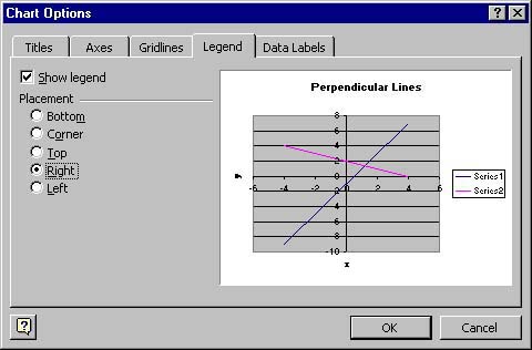
*Please note that if you have only one graph, you want your legend to be turned off.
Goto Chart --> Chart options
Under the "Legend" tab, you have to select the check box next to " Show legend". If you choose to have your legend on, you are given the option of placement. Generally, the right side is an appropiate place to have your legend. Never leave the series simply saying "Series 1."
To select the axis you want to format, double-click on the axis on the graph, and the "Format Axis" window will pop up. Goto the "Scale" tab, enter the numbers specified by the lab. You'll notice that the axis you are scaling is specified (i.e. red arrow).
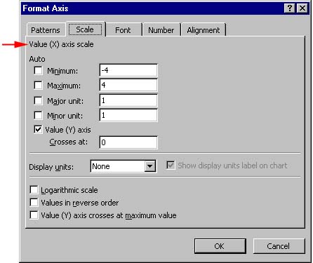
This formatting window can also be used to obtain logarithmic scales. If the numbers on the axis are too large, you can use the Number folder to select a more appropriate format.
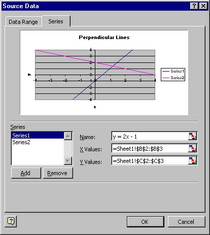
Goto Chart --> Source Data
Select the "series" tab. Make sure the series you are going to name is highlighted (this is done by clicking on the series inside the "series" window. Once the series is selected, enter the name in the name field to the right. Do the same thing for the other series. As you switch between series, you'll notice changes immediately in the preview window.
Suppose you want to add some text in the graph. To accomplish this, you click on the graph to highlight it. Then type in the text window at the bottom of the toolbar. When you hit return, the text will appear in the middle of the graph. You simply drag this text to wherever you want in the graph for the appropriate labeling. (Note: This is sometimes superior to using the legend that Excel provides you.) If you want to change the size or style of the font of this text, double click on the right side of the box surrounding the text. (You may have to click on the text once to highlight it.) A menu box appears, and you can select the options to make the text as pretty as you want.